Forecasting the Real Estate Market

A Comparative Analysis of Classical vs. Modern Time Series Models on Housing Prices

Data-Science
Author

Renan Monteiro Barbosa

Load the required packages

Code
packages <- c("tidyverse", "lubridate", "tseries", "forecast", "xts",  "prophet", "feasts", "patchwork", "dplyr", "plotly", "DT", "skimr", "fpp3")
# install.packages(packages)
lapply(packages, library, character.only = TRUE)
# Set seed for reproducibility
set.seed(123)

1. Chapter 1: Introduction

The residential real estate market has become a critical focal point for investors and policymakers, particularly in the wake of recent market volatility, underscoring the importance of accurate and timely housing indicators.[1] To assess housing market movements, a robust House Price Index (HPI) is essential, aiming to reflect the price change experienced by a typical house within a geographical area. This type of data is critical for data-driven investment opportunity analysis in the real estate sector. As Clapp, et al write that “…a residential price index should represent the price change experienced by a typical house within the geographical area covered by the index[2(p. 270)].”

In contrast to other Home Value Indices, the Zillow Home Value Index (ZHVI) is a smoothed, seasonally adjusted measure of the typical home value and market changes. The ZHVI addresses the shortcomings of repeat-sales by being an estimate based on all homes within a region, leveraging Zestimates (Zillow’s proprietary home valuation model) instead of relying solely on actual sales data. This characteristic, in theory, provides a more comprehensive and timely picture than indices based exclusively on transacted homes. The ZHVI reflects the typical value for homes in the 35th to 65th percentile range.

While the ZHVI is a prominent indicator that has gained a lot of popularity, there is still the need for research comparing its predictive performance against median sales prices for evaluating its utility in forecasting price changes in the market.

Research Objective and Data

This analysis focuses on the application of time series methods to forecast home values, utilizing the State_time_series.csv dataset from the Zillow Economics Data[3] (Kaggle) which provides monthly observations spanning from 1996-04-30 to 2017-12-31.

The objective of this analysis is two-fold:

  • To analyze the time series properties of the ZHVI (ZHVI_AllHomes) and the House Median Sales Prices (Sale_Prices) for Houses across different geographical locations (states).

  • To develop and compare time series models for the purpose of forecasting Home Value using the ZHVI (ZHVI_AllHomes) and the House Median Sales Prices (Sale_Prices) as the primary House Price indicators for providing actionable insights for real estate investment and market understanding.

1.1 Literature Review

The development of robust House Price Indices (HPIs) is predicated on solving the challenge of isolating genuine price movement from changes in the characteristics of the transacted homes. Simple aggregate measures, such as the Median Sales Price (MSP), suffer from pervasive compositional bias because they only reflect the subset of homes sold—the “transaction flow”—rather than the overall market stock.[4] If a period sees an increase in the proportion of higher-value homes sold, the MSP is upwardly biased, regardless of whether the intrinsic value of comparable existing homes has actually changed.[5] Furthermore, classical repeat-sales indices, while controlling for quality by tracking only properties sold multiple times, exclude single sales, notably new constructions, leading to a potential censoring bias and an index unrepresentative of the entire market.[4] [1]

The Zillow Home Value Index (ZHVI) was developed to mitigate these methodological shortcomings, positioning itself as an indicator of the entire housing stock value rather than solely transactional data. By utilizing a hedonic mass appraisal technique (Zestimates), ZHVI estimates the value of both sold and unsold homes, thereby addressing the censoring bias that affects traditional indices.[5] This unique methodology grants the ZHVI exceptional timeliness compared to conventional repeat-sales indices, like Case-Shiller, which are inherently delayed due to the necessity of collecting and matching reported transactions.[5] The timely and broad footprint afforded by ZHVI is critical for its utility in sophisticated forecasting, demonstrating high dependability in predicting slower-moving, transaction-based indices.[6]

A similar, non-transactional approach is seen in indices like the FipeZap Index, which leverages massive volumes of advertised (asking) prices.[7] Acknowledging the “evident gap” between asking and realized prices, this approach operates under the pragmatic assumption that asking prices and transactional prices maintain a “similar trend” over the medium and long run.[7] To control for compositional shifts in the advertised data, these indices employ a rigorous stratification methodology, segmenting price movement by defined geographical areas and property characteristics, such as the number of bedrooms. The present comparative study tests whether the methodological benefits of these non-transactional, stock-based HPIs (ZHVI), which are adjusted for quality and composition, translate into superior predictive accuracy compared to volatile, transaction-based metrics (MSP).

For the purpose of forecasting, this analysis employs three established time series models, starting with the classical AutoRegressive Integrated Moving Average (ARIMA) family. ARIMA models are highly valued in econometrics for their interpretability but require the input series to be stationary, necessitating a differencing step (\(d\)) to remove trends and non-constant statistical properties inherent in most aggregate HPI data. The extension of this framework, SARIMA (Seasonal ARIMA), is the appropriate linear model for housing market analysis.[8] SARIMA explicitly integrates seasonal components, essential for capturing calendar effects in monthly data, and its extension, SARIMAX (Seasonal ARIMA with exogenous variables), allows for the inclusion of external exogenous variables (\(\text{X}\)), enabling the systematic testing of how macro-economic drivers influence home value fluctuations.[9]

In contrast, the PROPHET model[10], developed by Facebook, offers a modern, non-parametric decomposition approach specifically engineered for business time series that exhibit strong trends and seasonality. Prophet decomposes the time series into trend, seasonality, and holiday components with an additional error term, utilizing a piece-wise constant rate of growth with automatic selection of change points.[11] This feature is highly advantageous for a long-term data series (1996-2017) that encompasses significant structural breaks, such as the 2008 financial crisis, as it models these regime shifts gracefully without manual intervention, offering robustness against non-linear changes and data noise.[11]

The selection of these models establishes a crucial empirical comparison between forecasting philosophies. Classical, parametric methods (ARIMA, SARIMA, SARIMAX …) demand careful tuning and pre-processing to ensure stationarity, but offer highly interpretable linear coefficients.[12] [13] Conversely, modern decomposition models (Prophet) prioritize automation and flexibility.[10] Comparative studies have demonstrated that while Prophet is significantly faster and simpler to deploy, it can sometimes be “considerably less accurate” than optimally tuned ARIMA-class models, yielding higher Root Mean Square Error (RMSE) values.[14] Nonetheless, the established track record of ARIMA models makes them a critical and powerful competitive benchmark.[15]

Ultimately, the goal of this analysis is to evaluate the predictive utility of the data source (ZHVI vs. MSP) and the modeling paradigm (SARIMAX vs. Prophet). The comparative assessment of performance metrics (RMSE, MAE) will determine whether the statistical smoothing and quality-adjustment inherent in the ZHVI, when combined with either the rigorous interpretability of classical SARIMAX or the automated flexibility of Prophet, yields superior, actionable insights for forecasting price movements in the volatile residential real estate market.

2. Chapter 2: Dataset Preliminary Analysis

During the Preliminary Analysis we will load and pre-process the dataset, then we will make the time series plots for and overall visual inspection and understanding of the dataset. Further we will check for Stationarity and Seasonality on the data.

2.1 Load the Dataset

The Dataset Zillow Economics Data[3], can be downloaded:

```{bash}
#!/bin/bash
curl -L -o ~/Downloads/zecon.zip\
  https://www.kaggle.com/api/v1/datasets/download/zillow/zecon
```

We will be loading the raw dataset into the dataframe object: all_states_data

Code
find_git_root <- function(start = getwd()) {
  path <- normalizePath(start, winslash = "/", mustWork = TRUE)
  while (path != dirname(path)) {
    if (dir.exists(file.path(path, ".git"))) return(path)
    path <- dirname(path)
  }
  stop("No .git directory found — are you inside a Git repository?")
}

repo_root <- find_git_root()
datasets_path <- file.path(repo_root, "datasets")
zillow_economics_data_path <- file.path(datasets_path, "zillow-economics-data-01")

state_time_series <- file.path(zillow_economics_data_path, "State_time_series.csv")
all_states_data <- read.csv(state_time_series)

2.2 Dataset Pre-Processing

We will generate a dataframe containing the National Average for making a simpler overall forecasting model capable of generalizing and that fits the purpose of this project which is forecasting market for forming data based opinion for investment strategy. Furthermore, we will organize the dataframes for future work being able of a further comparison and analysis containing each State data for ZHVI (Zillow Home Value Index) and Sale_Prices (House Median Sales Prices).

Code
# Load and preprocess the data
# df <- read_csv('State_time_series.csv')
df = all_states_data
all_states_data2 <- all_states_data

# -----------------------------
# Keep the values of Each State
# -----------------------------
all_states_data2$Date <- as.Date(all_states_data2$Date)

all_states_price <- all_states_data2 %>%
  select(Date, RegionName, ZHVI_AllHomes, Sale_Prices) %>%
  # Remove any missing values for this metric
  na.omit()

# -----------------------------
# Generate the National Average
# -----------------------------

# Select and rename columns, similar to Python's pd.DataFrame(zip(...))
data <- df %>%
  select(Date = Date, Sale_Prices = Sale_Prices, ZHVI = ZHVI_AllHomes) %>%
  mutate(Date = ymd(Date)) # Convert to date object

# Drop rows with any NA in the three columns and reset index (implicitly handled by R data frames)
data1_drop <- data %>%
  filter(complete.cases(.))

# Convert to a time-series object by month, taking the mean
# This R approach uses xts/ts and dplyr for resampling and aggregation
data_month_full <- data1_drop %>%
  mutate(Date_Month = floor_date(Date, "month")) %>% # Group by the start of the month
  group_by(Date_Month) %>%
  summarise(
    Sale_Prices = mean(Sale_Prices),
    ZHVI = mean(ZHVI)
  ) %>%
  ungroup() %>%
  rename(Date = Date_Month)

# Drop the last month (2017-12-31 in Python, so the last month in R)
data_month_full <- data_month_full %>% 
  slice(-n()) 

# Create the final time series object (ts) for analysis
# Start and end are based on the data: e.g., 2008-01 to 2017-11
# The data runs from 2008-01-01 to 2017-11-01, which is 119 months
start_year <- year(min(data_month_full$Date))
start_month <- month(min(data_month_full$Date))
end_year <- year(max(data_month_full$Date))
end_month <- month(max(data_month_full$Date))

state_ts <- ts(data_month_full$Sale_Prices, 
               start = c(start_year, start_month), 
               end = c(end_year, end_month), 
               frequency = 12)

# Create a data frame for plotting and differencing
df1 <- data_month_full
df2 <- data_month_full
# Display the head of the data (similar to state_ts.head() in Python)
# head(df1)

Apply the a first order difference to generated the dataframe df1 which is later used for performing the Augmented Dickey-Fuller (ADF) stationarity Test, then used at chapter 3 for the PROPHET model and to generate the dataframe first_order_ts used to evaluate which ARIMA and SARIMA models should we fit.

# First order difference (used for stationarity test and one ARIMA model)
df1 <- df1 %>%
  mutate(first_order = Sale_Prices - lag(Sale_Prices, n = 1))

# head(df1)

2.2.1 Time Series Plot

Making an initial plot to observe the data for all states and the national average of Sale_Prices (House Median Sales Prices). We can obbserve that all plots have some trend and the National Average seems to capture well this trend.

Code
# Plot the time series
# plt_data <- df1
plt_data <- df2
all_states_price2 <- all_states_price

# Vector of all states
states <- c(
  "Alabama", "Alaska", "Arizona", "Arkansas", "California", "Colorado",
  "Connecticut", "Delaware", "DistrictofColumbia", "Florida", "Georgia", 
  "Idaho", "Illinois", "Kentucky", "Maryland", "Massachusetts", "Minnesota",
  "Missouri", "Montana", "Nebraska", "Nevada", "NewJersey", "NewMexico",
  "NewYork", "NorthCarolina", "NorthDakota", "Ohio", "Oklahoma", "Oregon",
  "Pennsylvania", "SouthCarolina", "Tennessee", "Texas", "Utah", "Virginia",
  "Washington", "WestVirginia", "Wisconsin", "Wyoming"
)

# Format RegionName
all_states_price2$RegionName <- trimws(all_states_price2$RegionName)

# ---- Create plot with all state traces ----
plt2 <- plot_ly()

for (s in states) {
  df_state <- all_states_price2 %>% filter(RegionName == s)
  
  plt2 <- plt2 %>% add_lines(
    data = df_state,
    x = ~Date,
    y = ~Sale_Prices,
    name = s,
    visible = ifelse(s == states[1], TRUE, FALSE),  # Only first state visible initially
    hovertemplate = paste("<b>", s, "</b><br>Date: %{x}<br>Sale Price: %{y}<extra></extra>")
  )
}

# ---- Add National Average Trace (df1 or plt_data) ----
# dash = "dash"
plt2 <- plt2 %>% add_lines(
  data = plt_data,        # df1 in your code
  x = ~Date,
  y = ~Sale_Prices,
  name = "National Average",
  visible = FALSE,
  line = list(color = "black", width = 3)
)

# Total number of traces
n_traces <- length(states) + 1   # 39 states + 1 national

# ---- Build dropdown buttons ----
dropdown_buttons <- list()

# 1) One button per state
for (i in seq_along(states)) {
  visible_vec <- rep(FALSE, n_traces)
  visible_vec[i] <- TRUE    # Show only this state trace
  
  dropdown_buttons[[length(dropdown_buttons) + 1]] <- list(
    method = "restyle",
    args = list("visible", as.list(visible_vec)),
    label = states[i]
  )
}

# 2) National Average button
visible_nat <- rep(FALSE, n_traces)
visible_nat[n_traces] <- TRUE  # last trace is national average

dropdown_buttons[[length(dropdown_buttons) + 1]] <- list(
  method = "restyle",
  args = list("visible", as.list(visible_nat)),
  label = "National Average"
)

# 3) Show All button
dropdown_buttons[[length(dropdown_buttons) + 1]] <- list(
  method = "restyle",
  args = list("visible", rep(TRUE, n_traces)),
  label = "Show All States"
)

# ---- Final Layout ----
plt2 <- plt2 %>% layout(
  title = "Interactive Sale Prices by State (Dropdown Menu)",
  xaxis = list(title = "Date"),
  yaxis = list(title = "Sale Prices"),
  updatemenus = list(list(
    active = 0,
    type = "dropdown",
    y = 1.15,
    x = 0.1,
    buttons = dropdown_buttons
  ))
)
plt2

Alternative to Plotly

Code
# Plot the time series
plt_data2 <- df1

national_avg_plot <- ggplot(plt_data2, aes(x = Date, y = Sale_Prices)) +
  geom_line(color = "black", linewidth = 1.2) + 
  labs(
    title = "National Average Home Sale Prices Over Time",
    x = "Date",
    y = "Sale Prices"
  ) +
  theme_minimal() +
  theme(
    plot.title = element_text(hjust = 0.5, face = "bold"),
    axis.title.x = element_text(margin = margin(t = 10)),
    axis.title.y = element_text(margin = margin(r = 10))
  )
national_avg_plot

2.3 Check Stationarity

Perform the Augmented Dickey-Fuller (ADF) test on the pre-processed Dataset containing only the National Average of Sale_Prices (House Median Sales Prices).

Code
# Create First order differenced series, dropping the first NA value
first_order_ts <- ts(df1$first_order[-1], 
                     start = c(start_year, start_month + 1), 
                     frequency = 12) 

# Augmented Dickey-Fuller (ADF) test for stationarity
adf_result <- adf.test(state_ts, alternative = "stationary")
adf_result_diff <- adf.test(first_order_ts, alternative = "stationary")
print(adf_result) # p-value = 0.5216

    Augmented Dickey-Fuller Test

data:  state_ts
Dickey-Fuller = -2.1324, Lag order = 4, p-value = 0.5216
alternative hypothesis: stationary

The Augmented Dickey-Fuller (ADF) test results shows the data is non-stationary. Therefore we must proceed wiht the first order differencing.

print(adf_result_diff) # p-value = 0.02763

    Augmented Dickey-Fuller Test

data:  first_order_ts
Dickey-Fuller = -3.6968, Lag order = 4, p-value = 0.02763
alternative hypothesis: stationary

ADF Results Summary

Series ADF Test p-value Decision (α = 0.05) Conclusion
Original (Yₜ) 0.5216 Fail to reject H₀ Non-Stationary
1st Difference (∇Yₜ) 0.02763 Reject H₀ Stationary

After the first order differencing the ADF test shows the data is now Stationary.

2.4 Check Seasonality

Althought visually inspecting the Time Series plots there is no real visual clues for seasonality, real-estate data is well known for containing seasonal structure. Therefore we implemented two methods for Seasonal decomposition:

  • additive time series decomposition.[16]

\(Y_t = T_t + S_t + e_t\)

  • Seasonal-Trend decomposition using LOESS (STL).[17]
Code
# Seasonal Decomposition
a <- decompose(state_ts, type = "additive")
b <- stl(state_ts, s.window = "periodic")

# Plot the Seasonal Decomposition of state_ts
# plot(a)
a1 = autoplot(a) # this looks better
b1 = autoplot(b)

Side by side Plot of both seasonal decomposition methods. They seem to have found similar results, there is indeed seasonal structure in the dataset.

a1 / b1

2.4 ACF and PACF Analysis

After handling the stationary with the first order differencing and identifying the dataset contains seasonal structure we will proceed to check the ACF and PACF plots to identify potential values for p and q.

acf(as.numeric(first_order_ts))

Interpretation of the ACF Plot

  1. Strong autocorrelation at lag-1
  • This means the series still has strong persistence, even after first differencing.
  • In other words: The differenced series still behaves like an AR(1) or higher-order autoregressive process.
  1. The ACF decreases slowly, but stays well above the significance bounds for lags 1 – 10+. This indicates that:
  • The series is not white noise.
  • There is remaining serial correlation after differencing.
  • A purely differenced model is insufficient.
  1. Many significant positive spikes up to lag ~12 suggests:
  • The process might need multiple AR terms, e.g., AR(2) or AR(3), etc.
  • Or there may be seasonality.

If this is monthly data, lags around 12 are good indication of annual seasonality.

  1. A few small negative spikes at higher lags
  • This is normal in AR processes.
  • The series gradually returns to zero correlation.
pacf(as.numeric(first_order_ts))

Interpretation of the PACF plot

There is a strong spike at lag 1, and all other lags drop well within the significance bands. With some minor activity around lag 4 and lag 11, but below the confidence threshold, not statistically meaningful.

This pattern is characteristic of AR(1) model: Cutoff in PACF at lag 1 and slow decay in ACF.

This rules out:

  • MA(q) (which would show ACF cutoff)
  • ARMA mixed models (which would have more complex ACF/PACF shapes)

Conclusion

Final Interpretation from the plots alone is that the differenced series first_order_ts behaves like: ARIMA(1,1,0). Because, there is no strong evidence of a seasonal cycle in the ACF or PACF. However, in the previous analysis we found evidence from the seasonal decomposition that the data actually has seasonal structure. Therefore we can assume ARIMA model will be insufficient and must proceed with SARIMA or althernative models. In the next seciton we will further explore and demonstrate how SARIMA and ARIMA will turn out to inadequate choices compared to better alternatives such as PROPHET.

3. Chapter 3: Secondary Analysis

In this section, we will fit different time series models ARIMA and SARIMA and then proceed to evaluate if the candiate models fit the required assumptions. Lastly we will compare their performance using model diagnostic techniques and select the most suitable model for forecasting.

The following is the pseudo-code for the custom ARIMA model evaluation function developed as an alternative to the auto.arima(), where I solely use the AIC as the criterion.

Code
# Function to fit and evaluate ARIMA models (using AIC as criterion)
evaluate_models <- function(data_ts, p_values, d_values, q_values) {
  best_score <- Inf
  best_cfg <- NULL
  
  for (p in p_values) {
    for (d in d_values) {
      for (q in q_values) {
        order <- c(p, d, q)
        
        tryCatch({
          model_fit <- Arima(data_ts, order = order, include.constant = TRUE)
          aic <- model_fit$aic
          
          if (aic < best_score) {
            best_score <- aic
            best_cfg <- order
          }
        }, error = function(e) {
        })
      }
    }
  }
  cat(sprintf('\nBest ARIMA(%d,%d,%d) AIC=%.3f\n', best_cfg[1], best_cfg[2], best_cfg[3], best_score))
}

\[\begin{array}{l} \hline \textbf{Algorithm 1:} \text{ ARIMA Model Evaluation} \\ \hline \textbf{Input:} \\ \quad \text{data\_ts:} \text{ Time series data} \\ \quad \text{p\_values:} \text{ List of AR orders } (p) \\ \quad \text{d\_values:} \text{ List of differencing orders } (d) \\ \quad \text{q\_values:} \text{ List of MA orders } (q) \\ \textbf{Output:} \\ \quad \text{best\_cfg:} \text{ The optimal ARIMA order } (p, d, q) \\ \quad \text{Prints: The optimal ARIMA configuration and AIC score} \\ \\ \text{initialize } \textit{best\_score} \leftarrow \infty \\ \text{initialize } \textit{best\_cfg} \leftarrow \text{NULL} \\ \\ \textbf{for each } p \textbf{ in } p\_\text{values} \textbf{ do} \\ \quad \textbf{for each } d \textbf{ in } d\_\text{values} \textbf{ do} \\ \quad \quad \textbf{for each } q \textbf{ in } q\_\text{values} \textbf{ do} \\ \quad \quad \quad \textit{order} \leftarrow (p, d, q) \\ \quad \quad \quad \textbf{try} \\ \quad \quad \quad \quad \textit{model\_fit} \leftarrow \text{Arima}(\textit{data\_ts}, \textit{order}, \textit{include.constant} = \text{TRUE}) \\ \quad \quad \quad \quad \textit{aic} \leftarrow \textit{model\_fit} \text{'s AIC value} \\ \quad \quad \quad \quad \textbf{if } \textit{aic} < \textit{best\_score} \textbf{ then} \\ \quad \quad \quad \quad \quad \textit{best\_score} \leftarrow \textit{aic} \\ \quad \quad \quad \quad \quad \textit{best\_cfg} \leftarrow \textit{order} \\ \quad \quad \quad \quad \textbf{end if} \\ \quad \quad \quad \textbf{catch} \text{ (error } e) \\ \quad \quad \quad \quad \text{continue} \quad \text{ // Skip to the next iteration if model fitting fails} \\ \quad \quad \quad \textbf{end try} \\ \quad \quad \textbf{end for} \\ \quad \textbf{end for} \\ \textbf{end for} \\ \\ \text{print } \text{'Best ARIMA('} \textit{best\_cfg}[1] \text{, } \textit{best\_cfg}[2] \text{, } \textit{best\_cfg}[3] \text{) AIC='} \textit{best\_score} \\ \hline \end{array}\]

3.1. Statistical Modelling

In this section we will proceed with fitting the ARIMA and SARIMA models into the split dataset composed by the training and test sets containing 80% for training and 20% for testing.

Code
# Define the split point for train and test sets (80% for training)
n_obs <- length(state_ts)
train_size <- floor(n_obs * 0.8)
train <- window(state_ts, end = time(state_ts)[train_size])
test <- window(state_ts, start = time(state_ts)[train_size + 1])

3.1.1. Fit model ARIMA

The ARIMA model is unlikely to work as we have concluded from the ACF and PACF plots followed by the seasonal decomposition. Nonetheless, for educational purpose we will proceed with trying to fit the following ARIMA models to demonstrate that ARIMA is indeed a poor choice of time series model to fit into this dataset. We discovered these candidate models using our custom evaluation function and with the auto.arima function.

  • ARIMA(4,1,0) AIC=1539.645
  • ARIMA(3,2,1) AIC=1521.03

Custom Evaluation Function

The custom evaluation function recommends the model ARIMA(4,1,0) with an AIC=1539.645.

# Using the split dataset (non stationary)
p_value1 <- 0:4
d_value1 <- 0:1
q_value1 <- 0:4
evaluate_models(train, p_value1, d_value1, q_value1) # Best ARIMA(4,1,0) AIC=1539.645

Best ARIMA(4,1,0) AIC=1539.645

Auto Arima evaluation

Code
arima1 <- auto.arima(train, trace = TRUE, seasonal = FALSE)

The auto arima recommends the model ARIMA(3,2,1) with AIC=1521.03.

summary(arima1) # ARIMA(3,2,1) AIC=1521.03
Series: train 
ARIMA(3,2,1) 

Coefficients:
         ar1      ar2      ar3      ma1
      0.3581  -0.1918  -0.2741  -0.5259
s.e.  0.2524   0.1087   0.1488   0.2627

sigma^2 = 989823:  log likelihood = -755.51
AIC=1521.03   AICc=1521.73   BIC=1533.58

Training set error measures:
                   ME     RMSE      MAE        MPE      MAPE       MASE
Training set 93.17795 962.2698 717.7441 0.05455226 0.3910338 0.08184315
                     ACF1
Training set -0.006056867

Model Fitting

Proceed with fitting the candidate ARIMA models and below we present their characteristic polynomial followed by their forecasting plots.

Code
model <- Arima(train, order = c(4,1,0))
model2 <- Arima(train, order = c(3,2,1))

Candidate ARIMA Model 1

\[\mathbf{(1 - 0.8587 B + 0.1203 B^2 + 0.2067 B^3 - 0.3084 B^4) (1 - B) y_t = \epsilon_t}\]

summary(model)
Series: train 
ARIMA(4,1,0) 

Coefficients:
         ar1      ar2      ar3     ar4
      0.8587  -0.1203  -0.2067  0.3084
s.e.  0.0990   0.1350   0.1451  0.1104

sigma^2 = 982551:  log likelihood = -763.86
AIC=1537.73   AICc=1538.43   BIC=1550.34

Training set error measures:
                   ME     RMSE      MAE        MPE      MAPE       MASE
Training set 31.10465 964.2226 715.2808 0.01983821 0.3875763 0.08156227
                    ACF1
Training set -0.03428434

Candidate ARIMA Model 2

\[\mathbf{(1 - 0.3581 B + 0.1918 B^2 + 0.2741 B^3) (1 - B)^2 y_t = (1 - 0.5259 B) \epsilon_t}\]

summary(model2)
Series: train 
ARIMA(3,2,1) 

Coefficients:
         ar1      ar2      ar3      ma1
      0.3581  -0.1918  -0.2741  -0.5259
s.e.  0.2524   0.1087   0.1488   0.2627

sigma^2 = 989823:  log likelihood = -755.51
AIC=1521.03   AICc=1521.73   BIC=1533.58

Training set error measures:
                   ME     RMSE      MAE        MPE      MAPE       MASE
Training set 93.17795 962.2698 717.7441 0.05455226 0.3910338 0.08184315
                     ACF1
Training set -0.006056867

Forecast plots

Code
# -------------------------------
# Forecast and evaluate -- model
# -------------------------------
len_test <- length(test)
arima_fc <- forecast(model, h = len_test, level = 95) 

# Accuracy metrics (MSE, RMSE, MAPE) are provided by the accuracy() function
arima_metrics <- accuracy(arima_fc, test)
# print(arima_metrics)

# Extract specific metrics
# MSE <- metrics[2, "MSE"]
RMSE_arima <- arima_metrics[2, "RMSE"]
MAPE_arima <- arima_metrics[2, "MAPE"]

# cat(sprintf("MSE: %.4e\n", MSE))
# cat(sprintf("RMSE: %.2f\n", RMSE_arima))
# cat(sprintf("MAPE: %.2f%%\n", MAPE_arima))

# -------------------------------
# Forecast and evaluate -- model2
# -------------------------------
# len_test <- length(test)
arima_fc2 <- forecast(model2, h = len_test, level = 95) 

# Accuracy metrics (MSE, RMSE, MAPE) are provided by the accuracy() function
arima_metrics2 <- accuracy(arima_fc2, test)
# print(arima_metrics2)

# Extract specific metrics
# MSE <- metrics[2, "MSE"]
RMSE_arima2 <- arima_metrics2[2, "RMSE"]
MAPE_arima2 <- arima_metrics2[2, "MAPE"]

# cat(sprintf("MSE: %.4e\n", MSE))
# cat(sprintf("RMSE: %.2f\n", RMSE_arima2))
# cat(sprintf("MAPE: %.2f%%\n", MAPE_arima2))

# -------------------------------
# Plot the forecast model
# -------------------------------
arima_plot1 <- autoplot(arima_fc) +
  autolayer(test, series="Actual") +
  autolayer(fitted(arima_fc), series="Fitted") +
  labs(title = 'Candidate ARIMA Model 1 Forecast vs Actuals', 
       x = "Date", 
       y = "Sale Prices") +
  theme_minimal() +
  # Add text annotations (using ggplot2 equivalent of plt.text)
  annotate("text", x = time(train)[length(train)], y = 170000, label = paste("AIC:", round(model$aic, 2)), hjust = 1) +
  annotate("text", x = time(train)[length(train)], y = 175000, label = paste("RMSE:", round(RMSE_arima, 2)), hjust = 1)
# -------------------------------
# Plot the forecast model2
# -------------------------------
arima_plot2 <- autoplot(arima_fc2) +
  autolayer(test, series="Actual") +
  autolayer(fitted(arima_fc2), series="Fitted") +
  labs(title = 'Candidate ARIMA Model 2 Forecast vs Actuals', 
       x = "Date", 
       y = "Sale Prices") +
  theme_minimal() +
  # Add text annotations (using ggplot2 equivalent of plt.text)
  annotate("text", x = time(train)[length(train)], y = 170000, label = paste("AIC:", round(model2$aic, 2)), hjust = 1) +
  annotate("text", x = time(train)[length(train)], y = 175000, label = paste("RMSE:", round(RMSE_arima2, 2)), hjust = 1)
arima_plot1 / arima_plot2

3.1.2. Fit model SARIMA

We discovered that the dataset has a seasonal structure. Intuitively as our next step is to proceed with exploring candidate SARIMA models using the auto.arima function and with the intuition drawn from the available information. Ultimately we will are at the two following candidate models:

  • SARIMA(1,1,0)x(0,1,1)[12], recommended auto.arima
  • SARIMA(1,1,0)x(1,1,0)[12] (best model)

Below we will describe the candidate models and showcase all the assumptions are met by demonstrating that the residuals satisfy the Ljung-Box test for autocorrelation and Shapiro Normality test. Lastly, we will showcase the Forecasting and conclusive evidence of RMSE, AIC and visual inspection

Candidate SARIMA model 1

\[(1 - 0.7453 B) (1 - B) (1 - B^{12}) y_t = (1 - 0.5768 B^{12}) \epsilon_t\]

Code
sarima_model <- auto.arima(train, stepwise = TRUE, trace = TRUE, seasonal = TRUE, D = 1)

 ARIMA(2,1,2)(1,1,1)[12]                    : 1364.569
 ARIMA(0,1,0)(0,1,0)[12]                    : 1423.264
 ARIMA(1,1,0)(1,1,0)[12]                    : 1359.082
 ARIMA(0,1,1)(0,1,1)[12]                    : 1377.46
 ARIMA(1,1,0)(0,1,0)[12]                    : 1367.91
 ARIMA(1,1,0)(2,1,0)[12]                    : 1359.651
 ARIMA(1,1,0)(1,1,1)[12]                    : 1357.983
 ARIMA(1,1,0)(0,1,1)[12]                    : 1356.001
 ARIMA(1,1,0)(0,1,2)[12]                    : 1358.033
 ARIMA(1,1,0)(1,1,2)[12]                    : Inf
 ARIMA(0,1,0)(0,1,1)[12]                    : 1416.233
 ARIMA(2,1,0)(0,1,1)[12]                    : 1357.964
 ARIMA(1,1,1)(0,1,1)[12]                    : 1357.927
 ARIMA(2,1,1)(0,1,1)[12]                    : Inf

 Best model: ARIMA(1,1,0)(0,1,1)[12]                    
Code
summary(sarima_model) # SARIMA(1,1,0)(0,1,1)[12]
Series: train 
ARIMA(1,1,0)(0,1,1)[12] 

Coefficients:
         ar1     sma1
      0.7453  -0.5768
s.e.  0.0761   0.1551

sigma^2 = 1196812:  log likelihood = -674.84
AIC=1355.68   AICc=1356   BIC=1362.83

Training set error measures:
                  ME     RMSE      MAE       MPE      MAPE       MASE
Training set 200.356 1001.887 747.3724 0.1129173 0.4086381 0.08522162
                    ACF1
Training set 0.002935922

Candidate SARIMA model 2

Code
summary(Arima(train, order = c(1,1,0), seasonal = list(order = c(1,1,0), period = 12)))
Series: train 
ARIMA(1,1,0)(1,1,0)[12] 

Coefficients:
         ar1     sar1
      0.7258  -0.3919
s.e.  0.0757   0.1104

sigma^2 = 1289013:  log likelihood = -676.38
AIC=1358.77   AICc=1359.08   BIC=1365.91

Training set error measures:
                   ME     RMSE     MAE        MPE      MAPE       MASE
Training set 150.6675 1039.763 779.756 0.08613913 0.4260813 0.08891426
                   ACF1
Training set 0.03086396

\[\mathbf{(1 - 0.7258 B) (1 + 0.3919 B^{12}) (1 - B) (1 - B^{12}) y_t = \epsilon_t}\]

Code
# SARIMA(1,1,0)(0,1,1)[12] 
sarima_model_fit2 <- Arima(train, order = c(1,1,0), seasonal = list(order = c(0,1,1), period = 12))
# SARIMA(1,1,0)x(1,1,0)[12] with zero mean as suggested by Auto ARIMA function with dataframe: first_order_ts
sarima_model_second <- Arima(train, order = c(1,1,0), seasonal = list(order = c(1,1,0), period = 12))

# summary(sarima_model_fit2)
# summary(sarima_model_second)

len_test <- length(test)

# -----------------------------
# SARIMA(1,1,0)(0,1,1)[12] Forecast and evaluate
# -----------------------------
# Forecast and evaluate RMSE: 5272.60
sarima_fc_series2 <- forecast(sarima_model_fit2, h = len_test, level = 95)
metrics_sarima2 <- accuracy(sarima_fc_series2, test)
# MSE_sarima <- metrics_sarima[2, "MSE"]
RMSE_sarima2 <- metrics_sarima2[2, "RMSE"]
MAPE_sarima2 <- metrics_sarima2[2, "MAPE"]

# cat(sprintf("MSE_sarima: %.4e\n", MSE_sarima))
# cat(sprintf("RMSE_sarima: %.2f\n", RMSE_sarima2))
# cat(sprintf("MAPE_sarima: %.2f%%\n", MAPE_sarima2))

# -----------------------------
# SARIMA(1,1,0)x(1,1,0)[12] with zero mean Forecast and evaluate
# -----------------------------
# Forecast and evaluate RMSE: 3137.42
sarima_fc_second_series <- forecast(sarima_model_second, h = len_test)
metrics_sarima_second <- accuracy(sarima_fc_second_series, test)
error_sarima_second_RMSE <- metrics_sarima_second[2, "RMSE"]
# cat(sprintf("RMSE: %.2f\n", error_sarima_second_RMSE))

# -----------------------------
# SARIMA(1,1,0)(0,1,1)[12] Forecast plot
# -----------------------------
p2 = autoplot(sarima_fc_series2) +
  autolayer(test, series="Actual") +
  autolayer(fitted(sarima_fc_series2), series="Fitted") +
  labs(title = 'SARIMA(1,1,0)(0,1,1)[12] ', 
       x = "Date", 
       y = "Sale Prices") +
  theme_minimal() +
  # Add text annotations
  annotate("text", x = time(train)[length(train)], y = 170000, label = paste("AIC:", round(sarima_model_fit2$aic, 2)), hjust = 1) +
  annotate("text", x = time(train)[length(train)], y = 175000, label = paste("RMSE:", round(RMSE_sarima2, 2)), hjust = 1)

# -----------------------------
# SARIMA(1,1,0)x(1,1,0)[12] with zero mean Forecast plot
# -----------------------------
# Plot the forecast
s4 = autoplot(sarima_fc_second_series) +
  autolayer(test, series="Actual") +
  autolayer(fitted(sarima_fc_second_series), series="Fitted") +
  labs(title = 'SARIMA(1,1,0)x(1,1,0)[12]', 
       x = "Date", 
       y = "Sale Prices") +
  theme_minimal() +
  # Add text annotations
  annotate("text", x = time(train)[length(train)], y = 170000, label = paste("AIC:", round(sarima_model_second$aic, 2)), hjust = 1) +
  annotate("text", x = time(train)[length(train)], y = 175000, label = paste("RMSE:", round(error_sarima_second_RMSE, 2)), hjust = 1)

Forecast plots

p2 / s4

Assumption testing

Code
# Residuals from each models. 
sarima_model_fit2.resid = resid(sarima_model_fit2) # SARIMA(1,1,0)x(0,1,1)[12]
sarima_model_second.resid = resid(sarima_model_second) # SARIMA(1,1,0)x(1,1,0)[12] with zero mean

# Testing normality properties of residuals from each series in VAR(1) model. 
shapiro1 <- shapiro.test(sarima_model_fit2.resid) # SARIMA(1,1,0)x(0,1,1)[12]
shapiro2 <- shapiro.test(sarima_model_second.resid) # SARIMA(1,1,0)x(1,1,0)[12] with zero mean

# Ljung-Box test for autocorrelation
sarima_model_fit2.ljung_box_test <- Box.test(sarima_model_fit2.resid, lag=20, type="Ljung-Box") # SARIMA(1,1,0)x(0,1,1)[12]
sarima_model_second._ljung_box_test <- Box.test(sarima_model_second.resid, lag=20, type="Ljung-Box") # SARIMA(1,1,0)x(1,1,0)[12] with zero mean

# cat("Ljung-Box Test for Autocorrelation:\n")
# print(sarima_model_fit2.ljung_box_test) # SARIMA(1,1,0)x(0,1,1)[12]
# print(sarima_model_second._ljung_box_test) # SARIMA(1,1,0)x(1,1,0)[12] with zero mean

Shapiro Normality test

Candidate model 1: SARIMA(1,1,0)x(0,1,1)[12]

print(shapiro1) # SARIMA(1,1,0)x(0,1,1)[12]

    Shapiro-Wilk normality test

data:  sarima_model_fit2.resid
W = 0.985, p-value = 0.3673

Candidate model 2: SARIMA(1,1,0)x(1,1,0)[12]

print(shapiro2) # SARIMA(1,1,0)x(1,1,0)[12] with zero mean

    Shapiro-Wilk normality test

data:  sarima_model_second.resid
W = 0.98565, p-value = 0.4048

Ljung-Box Test for Autocorrelation:

Candidate model 1: SARIMA(1,1,0)x(0,1,1)[12]

print(sarima_model_fit2.ljung_box_test) # SARIMA(1,1,0)x(0,1,1)[12]

    Box-Ljung test

data:  sarima_model_fit2.resid
X-squared = 28.137, df = 20, p-value = 0.1062

Candidate model 2: SARIMA(1,1,0)x(1,1,0)[12]

print(sarima_model_second._ljung_box_test) # SARIMA(1,1,0)x(1,1,0)[12] with zero mean

    Box-Ljung test

data:  sarima_model_second.resid
X-squared = 22.46, df = 20, p-value = 0.3161

Assumption testing results

  • Candidate model 1: SARIMA(1,1,0)x(0,1,1)[12]
  • Candidate model 2: SARIMA(1,1,0)x(1,1,0)[12]
Test Model Null Hypothesis (H0) p-value α = 0.05 Decision Conclusion
Shapiro-Wilk Normality Test SARIMA(1,1,0)x(0,1,1)[12] Residuals are Normally Distributed. 0.3673 0.05 Fail to Reject H0 Normality assumption is met.
SARIMA(1,1,0)x(1,1,0)[12] Residuals are Normally Distributed. 0.4048 0.05 Fail to Reject H0 Normality assumption is met.
Ljung-Box Test for Autocorrelation (k=20) SARIMA(1,1,0)x(0,1,1)[12] Residuals are White Noise (no autocorrelation). 0.1062 0.05 Fail to Reject H0 Residuals are white noise.
SARIMA(1,1,0)x(1,1,0)[12] Residuals are White Noise (no autocorrelation). 0.3161 0.05 Fail to Reject H0 Residuals are white noise.
Code
# Prepare data for Prophet: needs columns 'ds' (Date) and 'y' (Value)
sales_pr <- df1 %>% 
  select(ds = Date, y = Sale_Prices)

# Split data (Prophet uses a data frame, not a ts object)
train_data_pr <- sales_pr[1:train_size, ]
test_data_pr <- sales_pr[(train_size + 1):n_obs, ]

# Fit Prophet model
prophet_fit <- prophet(train_data_pr)

# Make future dataframe for prediction (24 periods, Monthly start)
future <- make_future_dataframe(prophet_fit, periods = len_test, freq = 'month')

# Make prediction
prophet_pred <- predict(prophet_fit, future)

3.3. Fit Prophet Model

The Prophet model[10] is a procedure for forecasting time series data based on an additive model where non-linear trends are fit with yearly, weekly, and daily seasonality, plus holiday effects. It works best with time series that have strong seasonal effects and several seasons of historical data.

\[y(t) = g(t) + s(t) + h(t) + \epsilon_t \]

Where:

  • \(g(t)\) Trend component
  • \(s(t)\) Seasonality component
  • \(h(t)\) Holidays Component
  • \(\epsilon_t\) Error Term

3.3.1. Prophet model mathematical composition:

\(g(t)\) Trend component

The trend component \(g(t)\) models the non-periodic, fundamental evolution of the time series, representing growth or decay over the long term.

  1. Piecewise Linear Trend

From my understanding of the R package this is the default trend model.

\[g(t) = (k + \mathbf{a}(t)^T\mathbf{\delta})t + (m + \mathbf{a}(t)^T\mathbf{\gamma})\]

  • \(k\): The base growth rate.
  • \(\mathbf{\delta}\): A vector of rate adjustments, where \(\delta_j\) is the change in rate occurring at changepoint \(s_j\).
  • \(\mathbf{a}(t)\): An indicator vector that is \(1\) if \(t\) is past changepoint \(s_j\) and \(0\) otherwise, ensuring only relevant rate adjustments are applied.
  • \(m\) and \(\mathbf{\gamma}\): Offset parameters used to ensure the piecewise function remains continuous at each changepoint.

\(s(t)\): The Seasonality Component

The seasonality component \(s(t)\) models periodic fluctuations using a standard Fourier Series.

\[s(t) = \sum_{n=1}^{N} \left( a_n \cos \left(\frac{2\pi n t}{P}\right) + b_n \sin \left(\frac{2\pi n t}{P}\right) \right)\]

  • \(P\): The period of the seasonality (e.g., \(P=365.25\) for yearly seasonality, \(P=7\) for weekly seasonality).
  • \(N\): The number of Fourier terms (or order) to include. Increasing \(N\) makes the seasonality curve more flexible (i.e., less smooth).
  • \(a_n\) and \(b_n\): Parameters to be estimated via regression.

In practice from my understanding this was implemented as a matrix of Fourier terms: \(X(t)\) and a vector of coefficients \(\mathbf{\beta}\), where \(s(t) = X(t) \mathbf{\beta}\).

\(h(t)\): The Holiday Component

The holiday component \(h(t)\) is designed to incorporate the effects of regular or irregular events that have a predictable impact on the time series, just like the name suggests.

  • \(h(t)\) is modeled as a simple additive dummy variable for each holiday or event.
  • Each holiday is assigned a regression parameter (\(\kappa\)), which represents its estimated average impact on \(y(t)\).
  • This structure allows Prophet to estimate the impact of holidays even if they occur irregularly

\(\epsilon_t\): The Error Term

The error term \(\epsilon_t\) represents any remaining random or unmodeled noise in the time series.

tail(prophet_pred)
            ds    trend additive_terms additive_terms_lower
112 2017-06-01 229889.1     -1534.1456           -1534.1456
113 2017-07-01 230829.7     -1294.6232           -1294.6232
114 2017-08-01 231801.6      -714.4802            -714.4802
115 2017-09-01 232773.5      -311.2767            -311.2767
116 2017-10-01 233714.0      -225.6568            -225.6568
117 2017-11-01 234685.9      -286.5143            -286.5143
    additive_terms_upper     yearly yearly_lower yearly_upper
112           -1534.1456 -1534.1456   -1534.1456   -1534.1456
113           -1294.6232 -1294.6232   -1294.6232   -1294.6232
114            -714.4802  -714.4802    -714.4802    -714.4802
115            -311.2767  -311.2767    -311.2767    -311.2767
116            -225.6568  -225.6568    -225.6568    -225.6568
117            -286.5143  -286.5143    -286.5143    -286.5143
    multiplicative_terms multiplicative_terms_lower multiplicative_terms_upper
112                    0                          0                          0
113                    0                          0                          0
114                    0                          0                          0
115                    0                          0                          0
116                    0                          0                          0
117                    0                          0                          0
    yhat_lower yhat_upper trend_lower trend_upper     yhat
112   216096.1   240910.9    217667.0    243117.9 228355.0
113   215769.2   243546.6    217291.0    244690.6 229535.1
114   216472.0   245591.3    217298.0    246596.3 231087.1
115   216660.6   248894.3    217253.8    248638.7 232462.2
116   216824.5   250302.1    217174.1    250864.1 233488.4
117   216488.4   252730.3    216719.6    253226.4 234399.4

Plot prophet_fit vs prophet_pred

plot(prophet_fit, prophet_pred)

Plot Prophet Components

# Plot components
prophet_plot_components(prophet_fit, prophet_pred)
Warning: `aes_string()` was deprecated in ggplot2 3.0.0.
ℹ Please use tidy evaluation idioms with `aes()`.
ℹ See also `vignette("ggplot2-in-packages")` for more information.
ℹ The deprecated feature was likely used in the prophet package.
  Please report the issue at <https://github.com/facebook/prophet/issues>.

Extract the forecast for the test period and evaluate using the forecast plot

Code
# -----------------------------
# Extract the forecast for the test period and evaluate
# -----------------------------
prophet_pred_test <- prophet_pred %>%
  slice((train_size + 1):n())

# -----------------------------
# Calculate MSE/RMSE/MAPE here
# -----------------------------
test_actuals <- test_data_pr$y
test_forecast <- prophet_pred_test$yhat

MSE_pro <- mean((test_actuals - test_forecast)^2)
RMSE_pro <- sqrt(MSE_pro)
MAPE_pro <- mean(abs((test_actuals - test_forecast) / test_actuals)) * 100

# cat(sprintf("MSE_pro: %.4e\n", MSE_pro))
# cat(sprintf("RMSE_pro: %.2f\n", RMSE_pro))
# cat(sprintf("MAPE_pro: %.2f%%\n", MAPE_pro))

# -----------------------------
# Plot the forecast vs actuals with confidence interval
# -----------------------------
plot_data <- sales_pr %>%
  mutate(Type = if_else(row_number() <= train_size, "Training", "Actual"))

forecast_data <- prophet_pred %>%
  slice((train_size + 1):n()) %>%
  mutate(ds = ymd(ds))

prophet1 <- ggplot(plot_data, aes(x = ds, y = y)) +
  geom_line(aes(color = Type)) +
  geom_line(data = forecast_data, aes(y = yhat, color = "Forecast")) +
  geom_ribbon(data = forecast_data, aes(y = yhat, ymin = yhat_lower, ymax = yhat_upper), alpha = 0.15, fill = "black") +
  labs(title = 'Prophet Model Forecast vs Actuals', 
       x = "Date", 
       y = "Sale Prices") +
  scale_color_manual(values = c("Actual" = "red", "Training" = "black", "Forecast" = "blue")) +
  theme_minimal() +
  theme(legend.position = "top") +
  # Add text annotations
  annotate("text", x = max(train_data_pr$ds), y = 175000, label = paste("RMSE:", round(RMSE_pro, 2)), hjust = 1)

Plot the forecast vs actuals with confidence interval

prophet1

4. Chapter 4: Conclusion and Discussion

In this project we began with a comprehensive exploratory analysis that revealed seasonality, and evidence of non-stationarity in the original series. Seasonal and first-order differencing helped stabilize the mean and reduce trends, while ACF/PACF plots were insuficient for the identification of model orders and the function.

Then we proceeded to the model fitting phase where we explored and compared several approaches, including:

  • ARIMA, to prove that it was not fit;
  • SARIMA, to demonstrate its limitations;
  • PROPHET, which fits perfectly the use case.

It is needless to say that the PROPHET model demonstrated superior predictive accuracy (lowest RMSE and MAPE) for forecasting Sale_Prices (House Median Sales Prices) as we can see from the plot when compared to our best performing SARIMA model.

s4 / prophet1

The reason being is because the PROPHET model is generally superior to traditional statistical methods like ARIMA, SARIMA, GARCH, or VAR for house value forecasting because it is designed to handle the messy, non-stationary data and complex patterns characteristic of real estate markets with far greater ease and less required statistical expertise. Traditional models require the time series to be made stationary and demand intricate tuning of parameters based on autocorrelation analysis, which is difficult for non-experts and often fails to capture sharp, non-linear shifts typical of housing booms or busts. In contrast, Prophet uses a decomposable time series model that automatically fits trend, multiple periodic seasonalities (e.g., yearly housing cycles), and custom holiday effects (like major policy changes or economic events) using a Generalized Additive Model (GAM). This robust, automated approach to capturing structural changes and multiple seasonal cycles—along with its built-in resilience to missing data and outliers—makes Prophet more practical, scalable, and interpretable for business-oriented forecasting of complex house value time series.

Future work

Future work could explore the following avenues:

  • Hybrid Models: Combining SARIMA with GARCH or machine learning techniques (e.g., XGBoost, LSTM) to improve forecast accuracy.
  • Exogenous Variables: Incorporating additional features such as social economical indicators, invetments, news, idk need more ideas, to enhance model performance.
  • Real-time Forecasting: Implementing a real-time forecasting system that updates predictions as new data arrives, potentially using streaming data techniques.
  • The forecast horizon was relatively long (about 2 years). Market changes among many things can happen in 2 years, might need other strategy for validation

In future work, we recommend extending the model to include exogenous variables and experimenting with hybrid models that combine SARIMA with GARCH or nonlinear methods. M

References

1. Nagaraja, C. H., Brown, L. D., & Wachter, S. M. (2010). House price index methodology. Pre-Print/Working Paper.
2. Clapp, J. M., Giaccotto, C., & Tirtiroglu, D. (1991). Housing price indices based on all transactions compared to repeat subsamples. Real Estate Economics, 19(3), 270–285.
3. zillow. (n.d.). Zillow Economics Data. https://www.kaggle.com/datasets/zillow/zecon
4. Gatzlaff, D. H., & Haurin, D. R. (1997). Transactional case-shiller vs. Hedonic zillow housing price indices (HPI): Different construction, same conclusions. Journal of Real Estate Finance and Economics, 15(2), 169–187.
5. Rzepczynski, M., & Feng, W. (2025). Transactional (case–shiller) vs. Hedonic (zillow) housing price indices (HPI): Different construction, same conclusions? Real Estate, 2(4), 19.
6. Gudell, S. (2017). Accuracy in context: Why zillow’s case-shiller forecast is so dependable. In Zillow. https://www.zillow.com/research/zillow-case-shiller-forecast-14308/
7. Pesquisa Econômica Aplicada (FIPE), I. de, & Imóveis, Z. (2011). FipeZap index – methodology. FIPE – Fundação Instituto de Pesquisas Econômicas.
8. A, K. (2024). ARIMA vs SARIMA vs SARIMAX vs prophet for time series forecasting. https://kishanakbari.medium.com/arima-vs-sarima-vs-sarimax-vs-prophet-for-time-series-forecasting-a59d3cc932a3
9. Alharbi, F. R., & Csala, D. (2022). A seasonal autoregressive integrated moving average with exogenous factors (SARIMAX) forecasting model-based time series approach. Inventions, 7(4), 94.
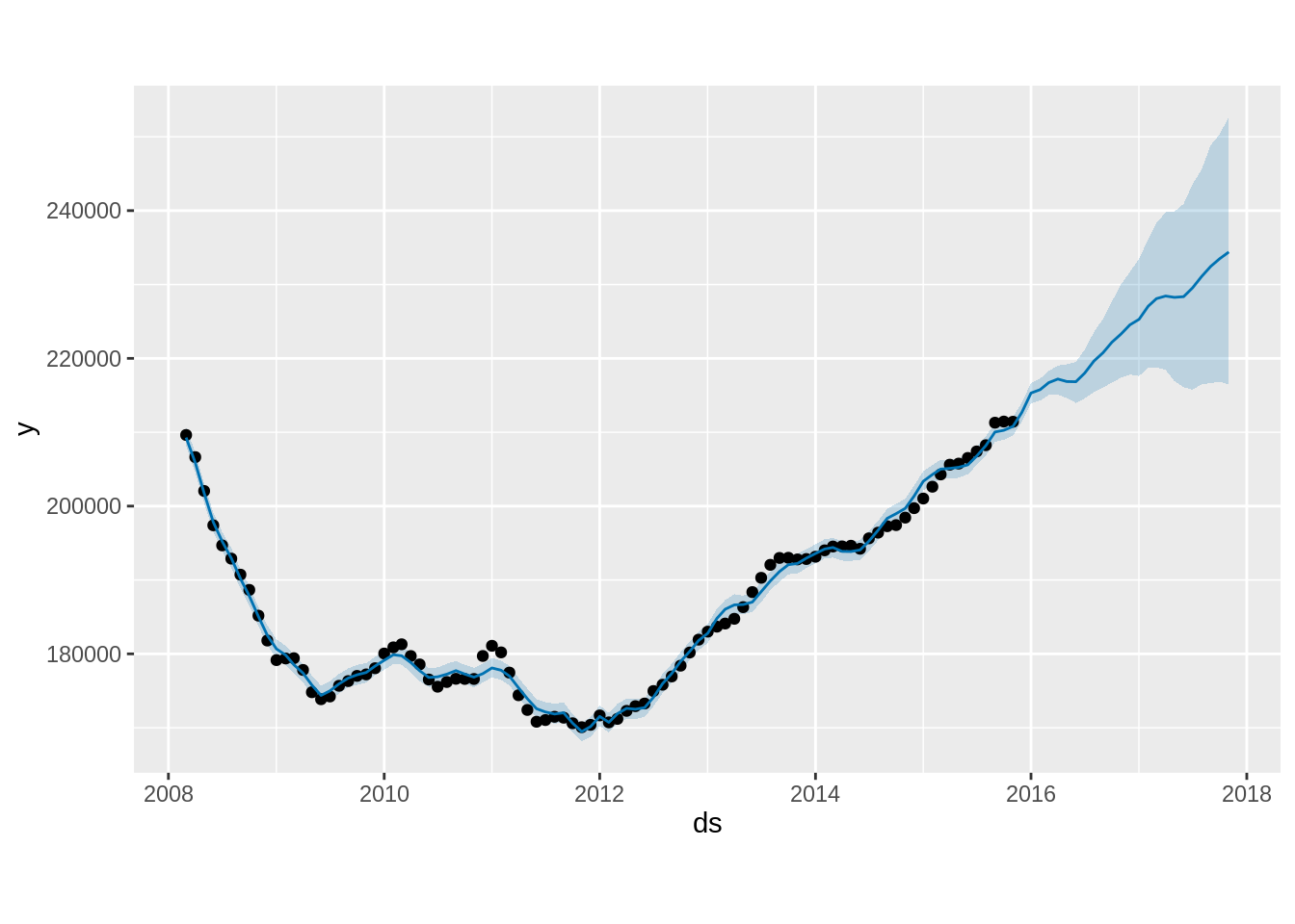
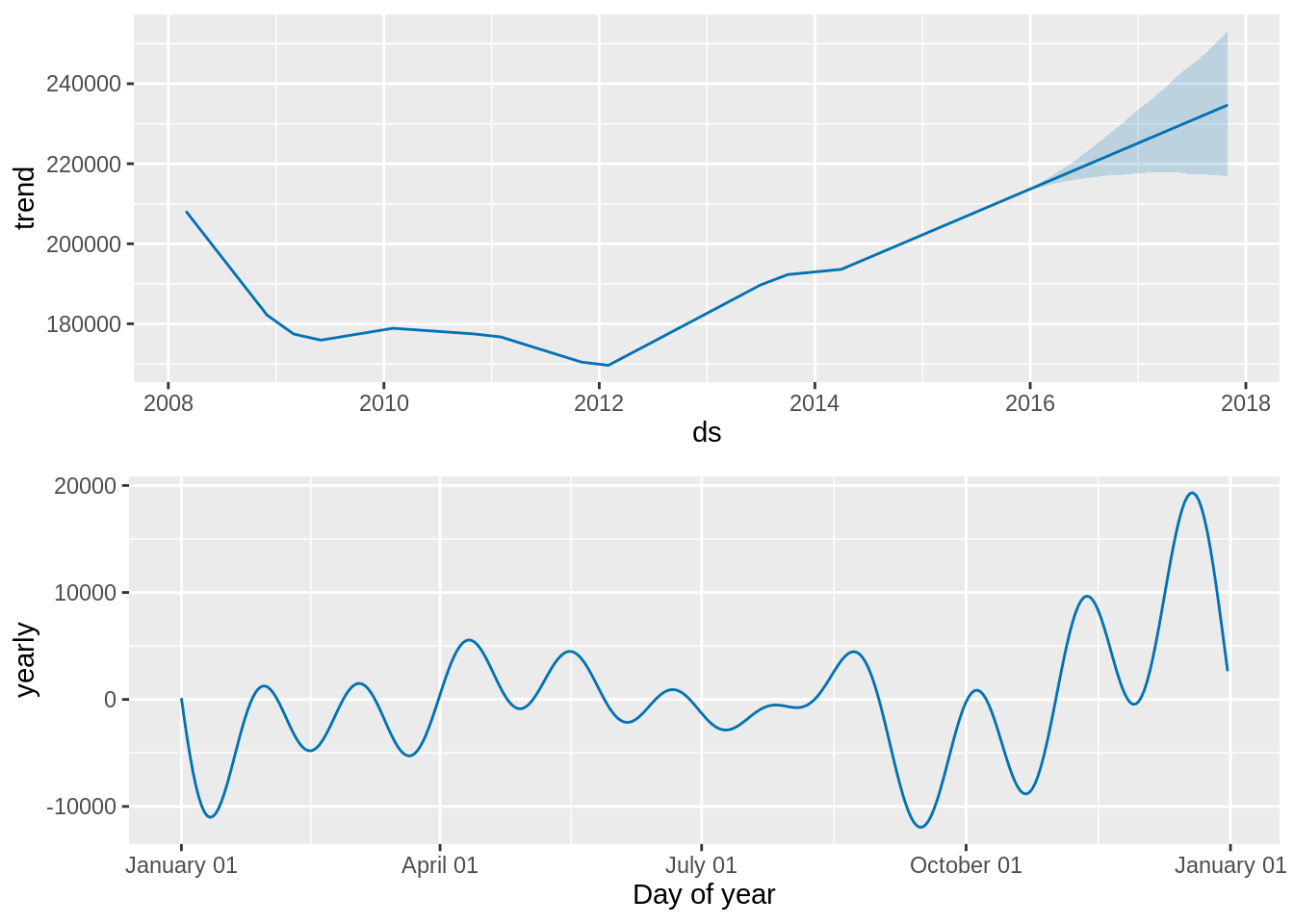
10. Taylor, S. J., & Letham, B. (2018). Forecasting at scale. The American Statistician, 72(1), 37–45.
11. Omotoye, E. A., & Rotimi, B. S. (2025). Stationarity in prophet model forecast: Performance evaluation approach. American Journal of Theoretical and Applied Statistics, 14(3), 109–117.
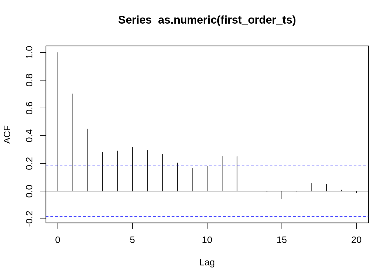
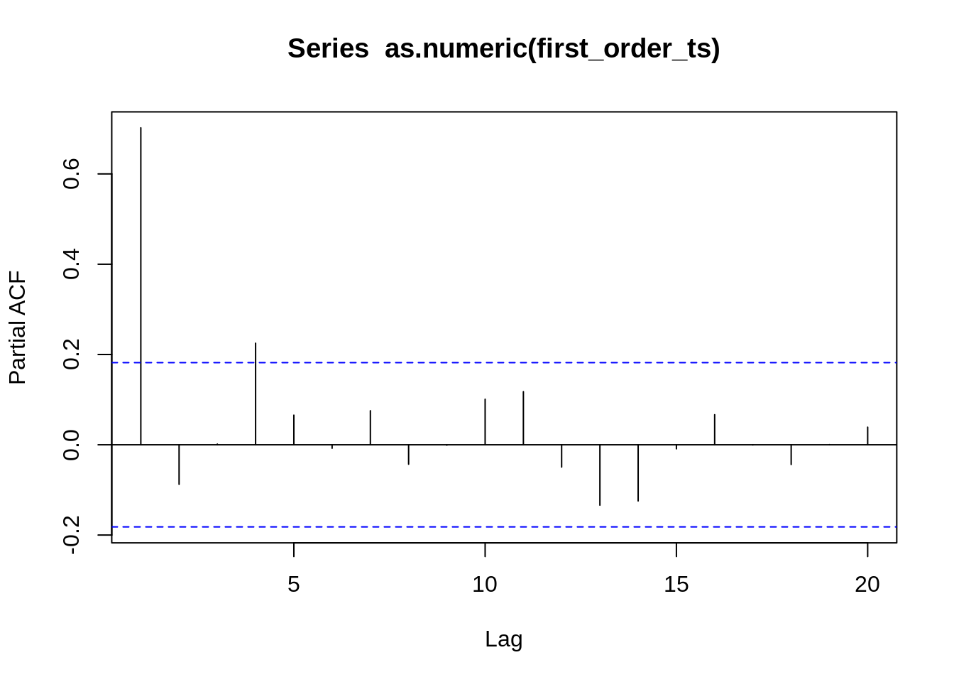
12. Hyndman, R. J., & Athanasopoulos, G. (2018). Forecasting: Principles and practice. OTexts.
13. Hyndman, R. J., & Athanasopoulos, G. (2018). 8.1 stationarity and differencing | forecasting: Principles and practice. https://otexts.com/fpp2/stationarity.html
14. Menculini, L., Marini, A., Proietti, M., Garinei, A., Bozza, A., Moretti, C., & Marconi, M. (2021). Comparing prophet and deep learning to ARIMA in forecasting wholesale food prices. Forecasting, 3(3), 644–662.
15. Vuong, P. H., Phu, L. H., Van Nguyen, T. H., Duy, L. N., Bao, P. T., & Trinh, T. D. (2024). A bibliometric literature review of stock price forecasting: From statistical model to deep learning approach. Science Progress, 107(1), 00368504241236557.
16. Kendall, M., & Stuart, A. (1983). The advanced theory of statistics, vol. 3: Distribution theory (pp. 410–414). Griffin.
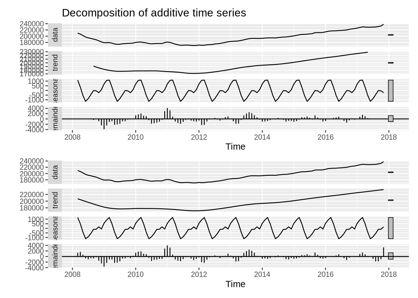
17. Cleveland, R. B., Cleveland, W. S., McRae, J. E., Terpenning, I., et al. (1990). STL: A seasonal-trend decomposition. J. Off. Stat, 6(1), 3–73.

Appendices

Dependencies

```{r}
#| code-fold: true
#| message: false
#| warning: false
#| output: false
packages <- c("tidyverse", "lubridate", "tseries", "forecast", "xts",  "prophet", "feasts", "patchwork", "dplyr", "plotly", "DT", "skimr", "fpp3")
# install.packages(packages)
lapply(packages, library, character.only = TRUE)
# Set seed for reproducibility
set.seed(123)
```

Dataset Preprocessing

```{r}
#| code-fold: true
#| output: false
find_git_root <- function(start = getwd()) {
  path <- normalizePath(start, winslash = "/", mustWork = TRUE)
  while (path != dirname(path)) {
    if (dir.exists(file.path(path, ".git"))) return(path)
    path <- dirname(path)
  }
  stop("No .git directory found — are you inside a Git repository?")
}

repo_root <- find_git_root()
datasets_path <- file.path(repo_root, "datasets")
zillow_economics_data_path <- file.path(datasets_path, "zillow-economics-data-01")

state_time_series <- file.path(zillow_economics_data_path, "State_time_series.csv")
all_states_data <- read.csv(state_time_series)
```
```{r}
#| code-fold: true
#| output: false

# Load and preprocess the data
# df <- read_csv('State_time_series.csv')
df = all_states_data
all_states_data2 <- all_states_data

# -----------------------------
# Keep the values of Each State
# -----------------------------
all_states_data2$Date <- as.Date(all_states_data2$Date)

all_states_price <- all_states_data2 %>%
  select(Date, RegionName, ZHVI_AllHomes, Sale_Prices) %>%
  # Remove any missing values for this metric
  na.omit()

# -----------------------------
# Generate the National Average
# -----------------------------

# Select and rename columns, similar to Python's pd.DataFrame(zip(...))
data <- df %>%
  select(Date = Date, Sale_Prices = Sale_Prices, ZHVI = ZHVI_AllHomes) %>%
  mutate(Date = ymd(Date)) # Convert to date object

# Drop rows with any NA in the three columns and reset index (implicitly handled by R data frames)
data1_drop <- data %>%
  filter(complete.cases(.))

# Convert to a time-series object by month, taking the mean
# This R approach uses xts/ts and dplyr for resampling and aggregation
data_month_full <- data1_drop %>%
  mutate(Date_Month = floor_date(Date, "month")) %>% # Group by the start of the month
  group_by(Date_Month) %>%
  summarise(
    Sale_Prices = mean(Sale_Prices),
    ZHVI = mean(ZHVI)
  ) %>%
  ungroup() %>%
  rename(Date = Date_Month)

# Drop the last month (2017-12-31 in Python, so the last month in R)
data_month_full <- data_month_full %>% 
  slice(-n()) 

# Create the final time series object (ts) for analysis
# Start and end are based on the data: e.g., 2008-01 to 2017-11
# The data runs from 2008-01-01 to 2017-11-01, which is 119 months
start_year <- year(min(data_month_full$Date))
start_month <- month(min(data_month_full$Date))
end_year <- year(max(data_month_full$Date))
end_month <- month(max(data_month_full$Date))

state_ts <- ts(data_month_full$Sale_Prices, 
               start = c(start_year, start_month), 
               end = c(end_year, end_month), 
               frequency = 12)

# Create a data frame for plotting and differencing
df1 <- data_month_full
df2 <- data_month_full
# Display the head of the data (similar to state_ts.head() in Python)
# head(df1)
```
```{r}
# First order difference (used for stationarity test and one ARIMA model)
df1 <- df1 %>%
  mutate(first_order = Sale_Prices - lag(Sale_Prices, n = 1))

# head(df1)
```

Plot of data

```{r}
#| code-fold: true
#| output: false

# Plot the time series
# plt_data <- df1
plt_data <- df2
all_states_price2 <- all_states_price

# Vector of all states
states <- c(
  "Alabama", "Alaska", "Arizona", "Arkansas", "California", "Colorado",
  "Connecticut", "Delaware", "DistrictofColumbia", "Florida", "Georgia", 
  "Idaho", "Illinois", "Kentucky", "Maryland", "Massachusetts", "Minnesota",
  "Missouri", "Montana", "Nebraska", "Nevada", "NewJersey", "NewMexico",
  "NewYork", "NorthCarolina", "NorthDakota", "Ohio", "Oklahoma", "Oregon",
  "Pennsylvania", "SouthCarolina", "Tennessee", "Texas", "Utah", "Virginia",
  "Washington", "WestVirginia", "Wisconsin", "Wyoming"
)

# Format RegionName
all_states_price2$RegionName <- trimws(all_states_price2$RegionName)

# ---- Create plot with all state traces ----
plt2 <- plot_ly()

for (s in states) {
  df_state <- all_states_price2 %>% filter(RegionName == s)
  
  plt2 <- plt2 %>% add_lines(
    data = df_state,
    x = ~Date,
    y = ~Sale_Prices,
    name = s,
    visible = ifelse(s == states[1], TRUE, FALSE),  # Only first state visible initially
    hovertemplate = paste("<b>", s, "</b><br>Date: %{x}<br>Sale Price: %{y}<extra></extra>")
  )
}

# ---- Add National Average Trace (df1 or plt_data) ----
# dash = "dash"
plt2 <- plt2 %>% add_lines(
  data = plt_data,        # df1 in your code
  x = ~Date,
  y = ~Sale_Prices,
  name = "National Average",
  visible = FALSE,
  line = list(color = "black", width = 3)
)

# Total number of traces
n_traces <- length(states) + 1   # 39 states + 1 national

# ---- Build dropdown buttons ----
dropdown_buttons <- list()

# 1) One button per state
for (i in seq_along(states)) {
  visible_vec <- rep(FALSE, n_traces)
  visible_vec[i] <- TRUE    # Show only this state trace
  
  dropdown_buttons[[length(dropdown_buttons) + 1]] <- list(
    method = "restyle",
    args = list("visible", as.list(visible_vec)),
    label = states[i]
  )
}

# 2) National Average button
visible_nat <- rep(FALSE, n_traces)
visible_nat[n_traces] <- TRUE  # last trace is national average

dropdown_buttons[[length(dropdown_buttons) + 1]] <- list(
  method = "restyle",
  args = list("visible", as.list(visible_nat)),
  label = "National Average"
)

# 3) Show All button
dropdown_buttons[[length(dropdown_buttons) + 1]] <- list(
  method = "restyle",
  args = list("visible", rep(TRUE, n_traces)),
  label = "Show All States"
)

# ---- Final Layout ----
plt2 <- plt2 %>% layout(
  title = "Interactive Sale Prices by State (Dropdown Menu)",
  xaxis = list(title = "Date"),
  yaxis = list(title = "Sale Prices"),
  updatemenus = list(list(
    active = 0,
    type = "dropdown",
    y = 1.15,
    x = 0.1,
    buttons = dropdown_buttons
  ))
)
```

Plot only National average

```{r}
#| code-fold: true
#| output: false

# Plot the time series
plt_data2 <- df1

national_avg_plot <- ggplot(plt_data2, aes(x = Date, y = Sale_Prices)) +
  geom_line(color = "black", linewidth = 1.2) + 
  labs(
    title = "National Average Home Sale Prices Over Time",
    x = "Date",
    y = "Sale Prices"
  ) +
  theme_minimal() +
  theme(
    plot.title = element_text(hjust = 0.5, face = "bold"),
    axis.title.x = element_text(margin = margin(t = 10)),
    axis.title.y = element_text(margin = margin(r = 10))
  )
```

ADF test

```{r}
#| code-fold: true
#| output: false

# Create First order differenced series, dropping the first NA value
first_order_ts <- ts(df1$first_order[-1], 
                     start = c(start_year, start_month + 1), 
                     frequency = 12) 

# Augmented Dickey-Fuller (ADF) test for stationarity
adf_result <- adf.test(state_ts, alternative = "stationary")
adf_result_diff <- adf.test(first_order_ts, alternative = "stationary")
```

Seasonal Decomposition

```{r}
#| code-fold: true
#| output: false

# Seasonal Decomposition
a <- decompose(state_ts, type = "additive")
b <- stl(state_ts, s.window = "periodic")

# Plot the Seasonal Decomposition of state_ts
# plot(a)
a1 = autoplot(a) # this looks better
b1 = autoplot(b)
```

Custom Evaluation Function

```{r}
#| code-fold: true
#| output: false

# Function to fit and evaluate ARIMA models (using AIC as criterion)
evaluate_models <- function(data_ts, p_values, d_values, q_values) {
  best_score <- Inf
  best_cfg <- NULL
  
  for (p in p_values) {
    for (d in d_values) {
      for (q in q_values) {
        order <- c(p, d, q)
        
        tryCatch({
          model_fit <- Arima(data_ts, order = order, include.constant = TRUE)
          aic <- model_fit$aic
          
          if (aic < best_score) {
            best_score <- aic
            best_cfg <- order
          }
        }, error = function(e) {
        })
      }
    }
  }
  cat(sprintf('\nBest ARIMA(%d,%d,%d) AIC=%.3f\n', best_cfg[1], best_cfg[2], best_cfg[3], best_score))
}
```

Dataset Splitting

```{r}
#| code-fold: true
#| output: false

# Define the split point for train and test sets (80% for training)
n_obs <- length(state_ts)
train_size <- floor(n_obs * 0.8)
train <- window(state_ts, end = time(state_ts)[train_size])
test <- window(state_ts, start = time(state_ts)[train_size + 1])
```

Apply the custom evaluation function

```{r}
# Using the split dataset (non stationary)
p_value1 <- 0:4
d_value1 <- 0:1
q_value1 <- 0:4
evaluate_models(train, p_value1, d_value1, q_value1) # Best ARIMA(4,1,0) AIC=1539.645
```

Auto ARIMA

```{r}
#| code-fold: true
#| output: false

arima1 <- auto.arima(train, trace = TRUE, seasonal = FALSE)
```

Fit ARIMA

```{r}
#| code-fold: true
#| output: false

model <- Arima(train, order = c(4,1,0))
model2 <- Arima(train, order = c(3,2,1))
```

Candidate MODEL arima forecasting

```{r}
#| code-fold: true
#| output: false

# -------------------------------
# Forecast and evaluate -- model
# -------------------------------
len_test <- length(test)
arima_fc <- forecast(model, h = len_test, level = 95) 

# Accuracy metrics (MSE, RMSE, MAPE) are provided by the accuracy() function
arima_metrics <- accuracy(arima_fc, test)
# print(arima_metrics)

# Extract specific metrics
# MSE <- metrics[2, "MSE"]
RMSE_arima <- arima_metrics[2, "RMSE"]
MAPE_arima <- arima_metrics[2, "MAPE"]

# cat(sprintf("MSE: %.4e\n", MSE))
# cat(sprintf("RMSE: %.2f\n", RMSE_arima))
# cat(sprintf("MAPE: %.2f%%\n", MAPE_arima))

# -------------------------------
# Forecast and evaluate -- model2
# -------------------------------
# len_test <- length(test)
arima_fc2 <- forecast(model2, h = len_test, level = 95) 

# Accuracy metrics (MSE, RMSE, MAPE) are provided by the accuracy() function
arima_metrics2 <- accuracy(arima_fc2, test)
# print(arima_metrics2)

# Extract specific metrics
# MSE <- metrics[2, "MSE"]
RMSE_arima2 <- arima_metrics2[2, "RMSE"]
MAPE_arima2 <- arima_metrics2[2, "MAPE"]

# cat(sprintf("MSE: %.4e\n", MSE))
# cat(sprintf("RMSE: %.2f\n", RMSE_arima2))
# cat(sprintf("MAPE: %.2f%%\n", MAPE_arima2))

# -------------------------------
# Plot the forecast model
# -------------------------------
arima_plot1 <- autoplot(arima_fc) +
  autolayer(test, series="Actual") +
  autolayer(fitted(arima_fc), series="Fitted") +
  labs(title = 'Candidate ARIMA Model 1 Forecast vs Actuals', 
       x = "Date", 
       y = "Sale Prices") +
  theme_minimal() +
  # Add text annotations (using ggplot2 equivalent of plt.text)
  annotate("text", x = time(train)[length(train)], y = 170000, label = paste("AIC:", round(model$aic, 2)), hjust = 1) +
  annotate("text", x = time(train)[length(train)], y = 175000, label = paste("RMSE:", round(RMSE_arima, 2)), hjust = 1)
# -------------------------------
# Plot the forecast model2
# -------------------------------
arima_plot2 <- autoplot(arima_fc2) +
  autolayer(test, series="Actual") +
  autolayer(fitted(arima_fc2), series="Fitted") +
  labs(title = 'Candidate ARIMA Model 2 Forecast vs Actuals', 
       x = "Date", 
       y = "Sale Prices") +
  theme_minimal() +
  # Add text annotations (using ggplot2 equivalent of plt.text)
  annotate("text", x = time(train)[length(train)], y = 170000, label = paste("AIC:", round(model2$aic, 2)), hjust = 1) +
  annotate("text", x = time(train)[length(train)], y = 175000, label = paste("RMSE:", round(RMSE_arima2, 2)), hjust = 1)
```

SARIMA

```{r}
#| code-fold: true
sarima_model <- auto.arima(train, stepwise = TRUE, trace = TRUE, seasonal = TRUE, D = 1)
summary(sarima_model) # SARIMA(1,1,0)(0,1,1)[12]
```

Candidate model SARIMA 2

```{r}
#| code-fold: true
summary(Arima(train, order = c(1,1,0), seasonal = list(order = c(1,1,0), period = 12)))
```

SARIMA models Forecasting plots:

```{r}
#| code-fold: true
#| message: false
#| warning: false
#| output: false

# SARIMA(1,1,0)(0,1,1)[12] 
sarima_model_fit2 <- Arima(train, order = c(1,1,0), seasonal = list(order = c(0,1,1), period = 12))
# SARIMA(1,1,0)x(1,1,0)[12] with zero mean as suggested by Auto ARIMA function with dataframe: first_order_ts
sarima_model_second <- Arima(train, order = c(1,1,0), seasonal = list(order = c(1,1,0), period = 12))

# summary(sarima_model_fit2)
# summary(sarima_model_second)

len_test <- length(test)

# -----------------------------
# SARIMA(1,1,0)(0,1,1)[12] Forecast and evaluate
# -----------------------------
# Forecast and evaluate RMSE: 5272.60
sarima_fc_series2 <- forecast(sarima_model_fit2, h = len_test, level = 95)
metrics_sarima2 <- accuracy(sarima_fc_series2, test)
# MSE_sarima <- metrics_sarima[2, "MSE"]
RMSE_sarima2 <- metrics_sarima2[2, "RMSE"]
MAPE_sarima2 <- metrics_sarima2[2, "MAPE"]

# cat(sprintf("MSE_sarima: %.4e\n", MSE_sarima))
# cat(sprintf("RMSE_sarima: %.2f\n", RMSE_sarima2))
# cat(sprintf("MAPE_sarima: %.2f%%\n", MAPE_sarima2))

# -----------------------------
# SARIMA(1,1,0)x(1,1,0)[12] with zero mean Forecast and evaluate
# -----------------------------
# Forecast and evaluate RMSE: 3137.42
sarima_fc_second_series <- forecast(sarima_model_second, h = len_test)
metrics_sarima_second <- accuracy(sarima_fc_second_series, test)
error_sarima_second_RMSE <- metrics_sarima_second[2, "RMSE"]
# cat(sprintf("RMSE: %.2f\n", error_sarima_second_RMSE))

# -----------------------------
# SARIMA(1,1,0)(0,1,1)[12] Forecast plot
# -----------------------------
p2 = autoplot(sarima_fc_series2) +
  autolayer(test, series="Actual") +
  autolayer(fitted(sarima_fc_series2), series="Fitted") +
  labs(title = 'SARIMA(1,1,0)(0,1,1)[12] ', 
       x = "Date", 
       y = "Sale Prices") +
  theme_minimal() +
  # Add text annotations
  annotate("text", x = time(train)[length(train)], y = 170000, label = paste("AIC:", round(sarima_model_fit2$aic, 2)), hjust = 1) +
  annotate("text", x = time(train)[length(train)], y = 175000, label = paste("RMSE:", round(RMSE_sarima2, 2)), hjust = 1)

# -----------------------------
# SARIMA(1,1,0)x(1,1,0)[12] with zero mean Forecast plot
# -----------------------------
# Plot the forecast
s4 = autoplot(sarima_fc_second_series) +
  autolayer(test, series="Actual") +
  autolayer(fitted(sarima_fc_second_series), series="Fitted") +
  labs(title = 'SARIMA(1,1,0)x(1,1,0)[12]', 
       x = "Date", 
       y = "Sale Prices") +
  theme_minimal() +
  # Add text annotations
  annotate("text", x = time(train)[length(train)], y = 170000, label = paste("AIC:", round(sarima_model_second$aic, 2)), hjust = 1) +
  annotate("text", x = time(train)[length(train)], y = 175000, label = paste("RMSE:", round(error_sarima_second_RMSE, 2)), hjust = 1)

```

SARIMA assumption testing

```{r}
#| code-fold: true
#| message: false
#| warning: false
#| output: false

# Residuals from each models. 
sarima_model_fit2.resid = resid(sarima_model_fit2) # SARIMA(1,1,0)x(0,1,1)[12]
sarima_model_second.resid = resid(sarima_model_second) # SARIMA(1,1,0)x(1,1,0)[12] with zero mean

# Testing normality properties of residuals from each series in VAR(1) model. 
shapiro1 <- shapiro.test(sarima_model_fit2.resid) # SARIMA(1,1,0)x(0,1,1)[12]
shapiro2 <- shapiro.test(sarima_model_second.resid) # SARIMA(1,1,0)x(1,1,0)[12] with zero mean

# Ljung-Box test for autocorrelation
sarima_model_fit2.ljung_box_test <- Box.test(sarima_model_fit2.resid, lag=20, type="Ljung-Box") # SARIMA(1,1,0)x(0,1,1)[12]
sarima_model_second._ljung_box_test <- Box.test(sarima_model_second.resid, lag=20, type="Ljung-Box") # SARIMA(1,1,0)x(1,1,0)[12] with zero mean

# cat("Ljung-Box Test for Autocorrelation:\n")
# print(sarima_model_fit2.ljung_box_test) # SARIMA(1,1,0)x(0,1,1)[12]
# print(sarima_model_second._ljung_box_test) # SARIMA(1,1,0)x(1,1,0)[12] with zero mean
```

Prophet model

```{r}
#| code-fold: true
#| message: false
#| warning: false
#| output: false

# Prepare data for Prophet: needs columns 'ds' (Date) and 'y' (Value)
sales_pr <- df1 %>% 
  select(ds = Date, y = Sale_Prices)

# Split data (Prophet uses a data frame, not a ts object)
train_data_pr <- sales_pr[1:train_size, ]
test_data_pr <- sales_pr[(train_size + 1):n_obs, ]

# Fit Prophet model
prophet_fit <- prophet(train_data_pr)

# Make future dataframe for prediction (24 periods, Monthly start)
future <- make_future_dataframe(prophet_fit, periods = len_test, freq = 'month')

# Make prediction
prophet_pred <- predict(prophet_fit, future)
```
```{r}
tail(prophet_pred)
```

Plot prophet_fit vs prophet_pred

```{r}
plot(prophet_fit, prophet_pred)
```

Plot Prophet Components

```{r}
# Plot components
prophet_plot_components(prophet_fit, prophet_pred)
```

Plot Prophet forecasting

```{r}
#| code-fold: true
#| message: false
#| warning: false
#| output: false

# -----------------------------
# Extract the forecast for the test period and evaluate
# -----------------------------
prophet_pred_test <- prophet_pred %>%
  slice((train_size + 1):n())

# -----------------------------
# Calculate MSE/RMSE/MAPE here
# -----------------------------
test_actuals <- test_data_pr$y
test_forecast <- prophet_pred_test$yhat

MSE_pro <- mean((test_actuals - test_forecast)^2)
RMSE_pro <- sqrt(MSE_pro)
MAPE_pro <- mean(abs((test_actuals - test_forecast) / test_actuals)) * 100

# cat(sprintf("MSE_pro: %.4e\n", MSE_pro))
# cat(sprintf("RMSE_pro: %.2f\n", RMSE_pro))
# cat(sprintf("MAPE_pro: %.2f%%\n", MAPE_pro))

# -----------------------------
# Plot the forecast vs actuals with confidence interval
# -----------------------------
plot_data <- sales_pr %>%
  mutate(Type = if_else(row_number() <= train_size, "Training", "Actual"))

forecast_data <- prophet_pred %>%
  slice((train_size + 1):n()) %>%
  mutate(ds = ymd(ds))

prophet1 <- ggplot(plot_data, aes(x = ds, y = y)) +
  geom_line(aes(color = Type)) +
  geom_line(data = forecast_data, aes(y = yhat, color = "Forecast")) +
  geom_ribbon(data = forecast_data, aes(y = yhat, ymin = yhat_lower, ymax = yhat_upper), alpha = 0.15, fill = "black") +
  labs(title = 'Prophet Model Forecast vs Actuals', 
       x = "Date", 
       y = "Sale Prices") +
  scale_color_manual(values = c("Actual" = "red", "Training" = "black", "Forecast" = "blue")) +
  theme_minimal() +
  theme(legend.position = "top") +
  # Add text annotations
  annotate("text", x = max(train_data_pr$ds), y = 175000, label = paste("RMSE:", round(RMSE_pro, 2)), hjust = 1)
```